Over the past seven weeks, I want from know less than nothing about app development to knowing way more than I ever thought I could. And after all my hard work…I want to go back to the beginning because I know I can do better. That right there is the devastation of prototyping. This ability to build something basically from scratch and see how many ways it goes wrong. Whether that be a user issue like they don’t understand a symbol to the app just not connecting to the right areas. Like I said weeks again, a well made app is never talked about, but a poorly made app is always complained about.

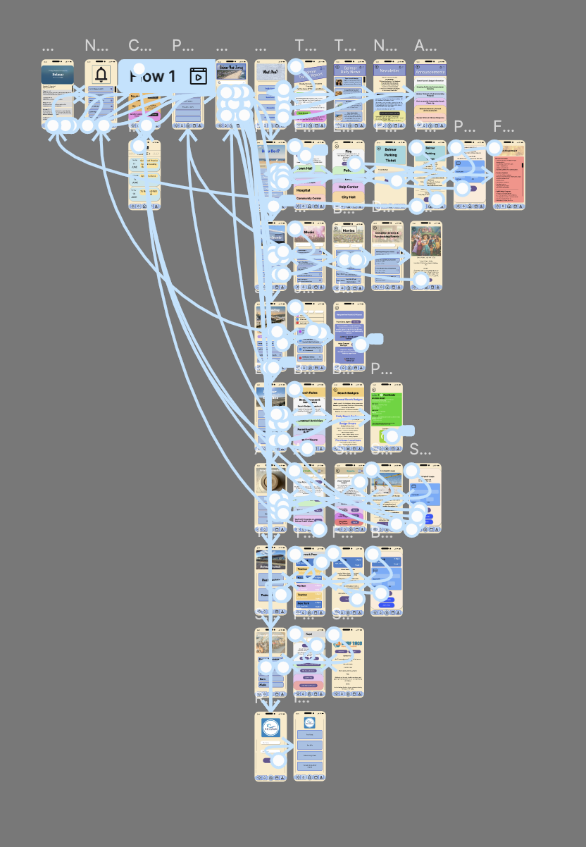
Below is a video of the Belmar Municipal App, I created for the beautiful town of Belmar NJ. As you watch the video there is a few things you need to understand.
- When I started the app I wanted it to be for summer Belmar visitors and residents alike
Throughout this process that became a harder feet than this app could manage. I wanted to make it a one stop shop for everyone but in doing that I think I forgot to tailor it down. At some points I think I added too much stuff for one little app.
- After struggling to understand the UI kit in the Figma system, the widgets and buttons are more minimal than originally intended.
I struggled with some of the formatting in the Figma web app, which ultimately was a big downfall for me. In finding this out to late I ended up having to practically redo the buttons and checkboxes three different times. Knowing what I know now, I think that changes some of the app flow.
- I probably spent to much time on design
As someone with a background in design, I focused too much of how to make it pretty over the idea of how to make it more functional. The design might need to be a more back burner activity because the content needs to work first.
- From the paper prototyping phase this app has come a long way
Throughout the paper prototyping and testing the app has seen a lot of changes for the better. The main point I took away from user testing was to focus more on the fine details. When someone clicks through the app they will notice something missing if it is truly important.
For example, during test subject #2, It was brought to my attention that I only used a footer bar on the main pages but once a user clicks past that all they could do wa hit back arrows until they arrived back at the original page they were on.
- This is all a learning process.
As long as it is still a prototype it can be fixed. With in the time given this is what I got done. But if I could go back and change things I would. I tested and learned, but now I feel even more like I need to test again. The more testing done the more user friendly the app will be.
Please enjoy the video and take into consideration what I just said.
What High Fidelity Prototyping Looks Like In Figma!

Please feel free to leave a comment on what you think could be improved!
Here is what I would change…
- Go back and find tune what is in each section. The “How Do I?” section still seems confusing, either get rid of it or rename it.
- Create a useable search bar for the home page and see if that can help
- Figure out the difference between Profile and Residents tabs. The further along the processes went the more confused I was of the differentiation of the two.
- Go back to the website and see if there is anything else important that’s missing. The website has a lot on the town council and the meetings and the app doesn’t have anything. Was that the right choice.
- Should something be added in the food and restaurants section for comments and ratings. Would adding small details help build a stronger community.
Overall, I am really proud of what I accomplished in the past seven weeks. This has been a hard process but I’m happy with the end results!
