
We as people take for granted the most basic and everyday things in our lives. This is true when it comes to websites and the design that goes into them. If a website is designed well most of the time the user doesn’t even notice or think about it. On the other hand if it’s bad and hard to navigate, someone will get annoyed with it. It’s super easy to ride that fine line, something that makes sense to the designer might not be as clear to the general public.
As a website designer, the job is more similar to a teacher. At the beginning of the process the designer must understand that most audiences are dumb and lazy… myself included some days. Breaking down the important aspect of the brand and company while making sure they stand out to the user.
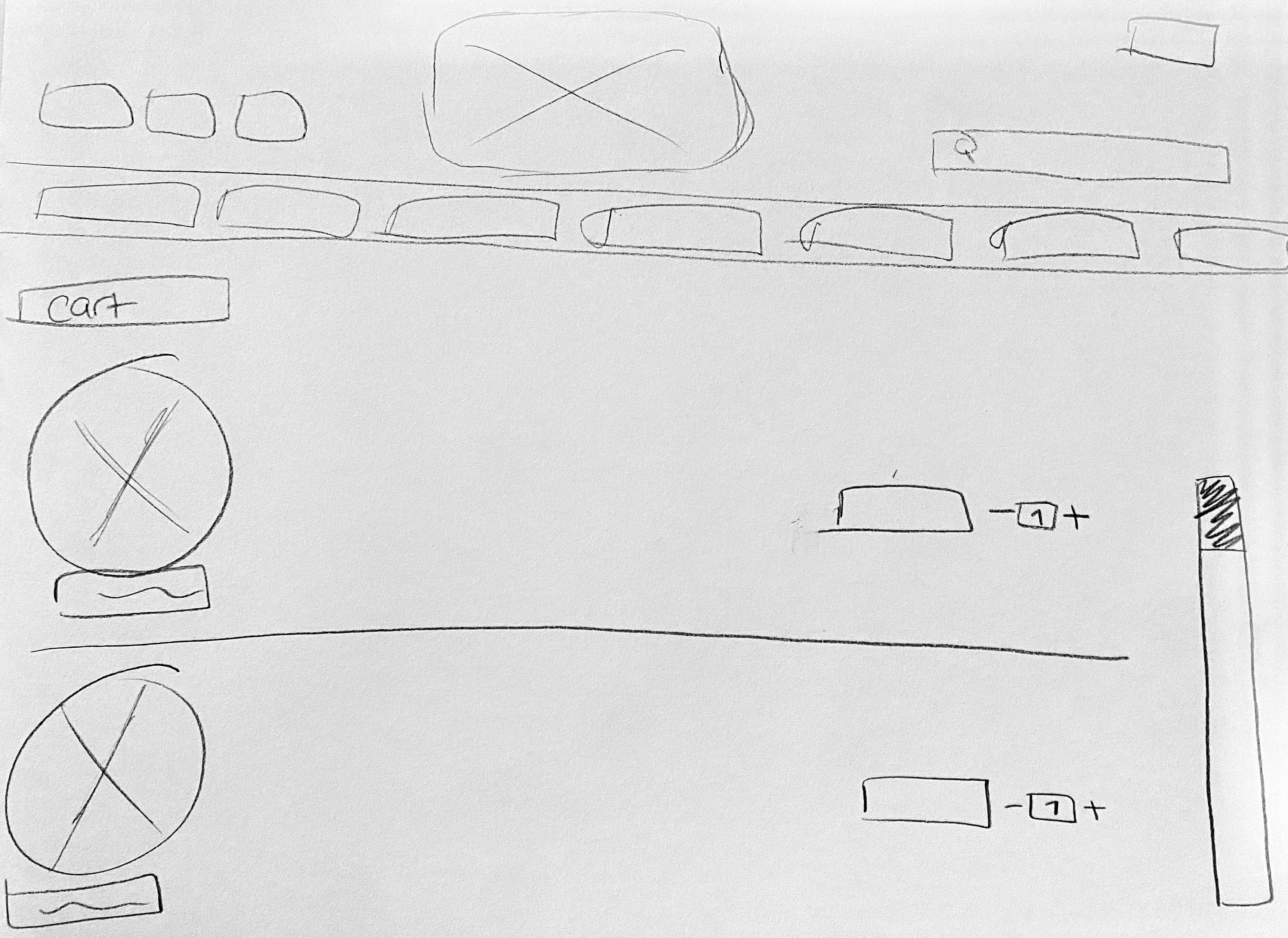
This week, I started that design process from scratch…or more accurately from sketch.
Below you can see the process of sketch to reality.
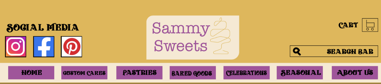
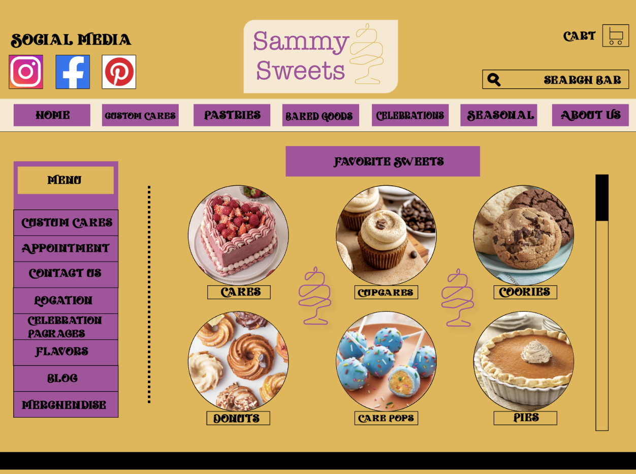
Homepage
Starting with the homepage I wanted to stick to the same yellow/gold and purple color palette of the logo. For me the decision to make the full page yellow was to draw in the intended audience and really make the sight inviting. As for the font, I went with something more twisty because it reminded me of a cake handwriting and I really want to make people feel a sense of joy when they saw it.
The home page is the main hub area, a place where people can find a lot of information. Including custom cake orders and setting up appointments. The main aspect of this company is custom orders and I want the audience to know that right away.
Outside of that, the other majorly important tabs are the celebration packages and flavors list. These are things that the target market comes to a bakery website for.
In the header section I also included social media links, a link to the shopping cart and a search bar for the ultimate convenience.
Throughout this site, you can see that I wanted it to feel like a place to go instead of a site to shop on. What I mean by that is, I wanted people to go to the site not only to buy products but to read the blog and get excited for new favorite items to try and the anticipation of seasonal once a year flavors to come back in season. I want the website to feel more like and experience than just a business transaction.

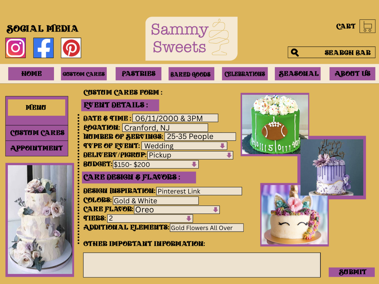
Custom Design
This tab drives the business, that’s why it’s the first one after the home page. In this tab you can set up appointments or if you are introverted like me, you can put in the important information about the cake design plus some inspiration pictures and the brand can give options back that fits within the parameters. The form helps all parties understand what the user is looking for.
Not everyone has the free time to set up an in person or even zoom appointment to talk about a custom cake, this is a way to help those people. It also fuels efficiency, because it want take as long for the brand to go through and come up with the design. The diversity of this tab is something not a lot of business have thus far but I can see becoming more and more useful.
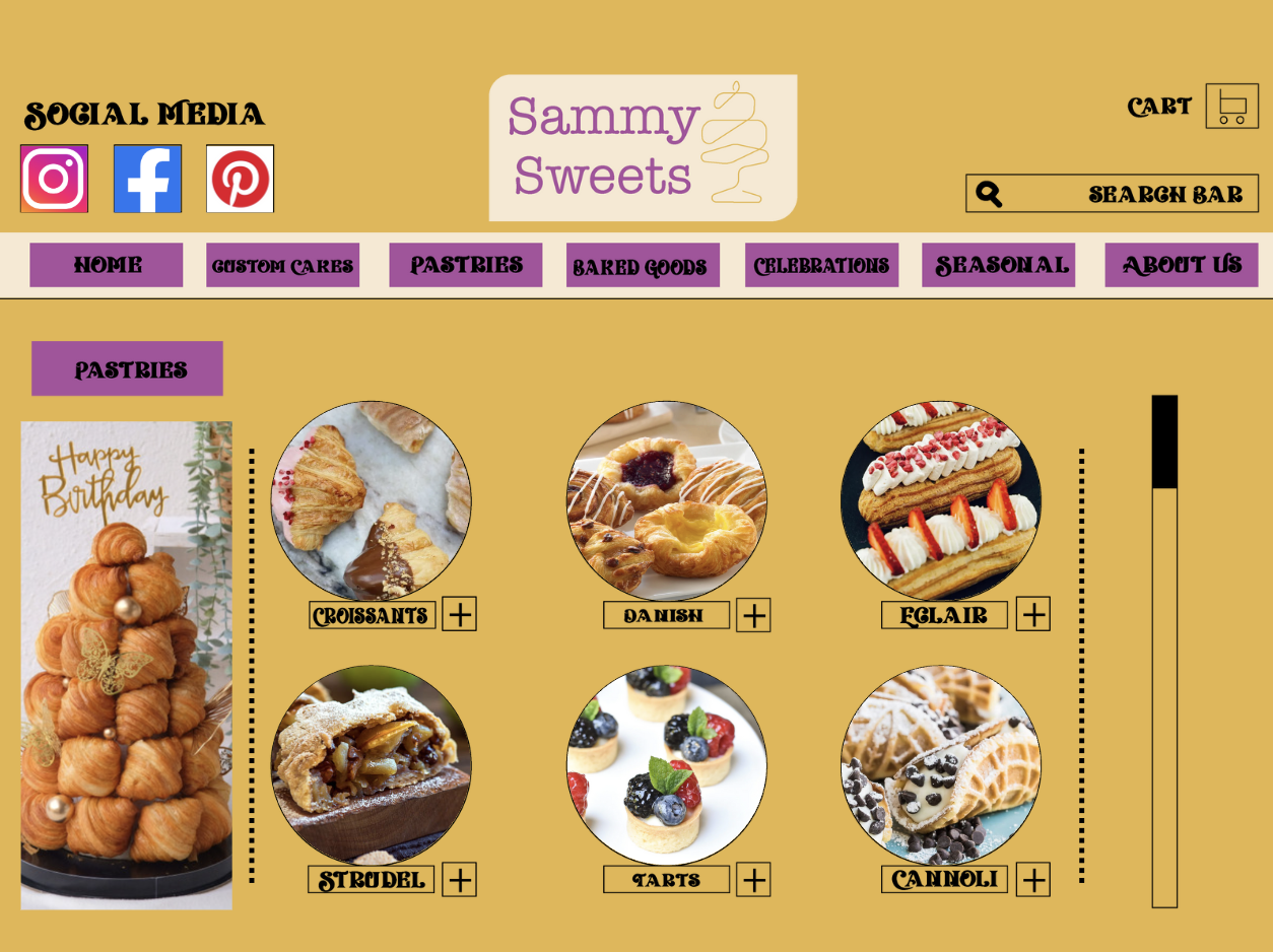
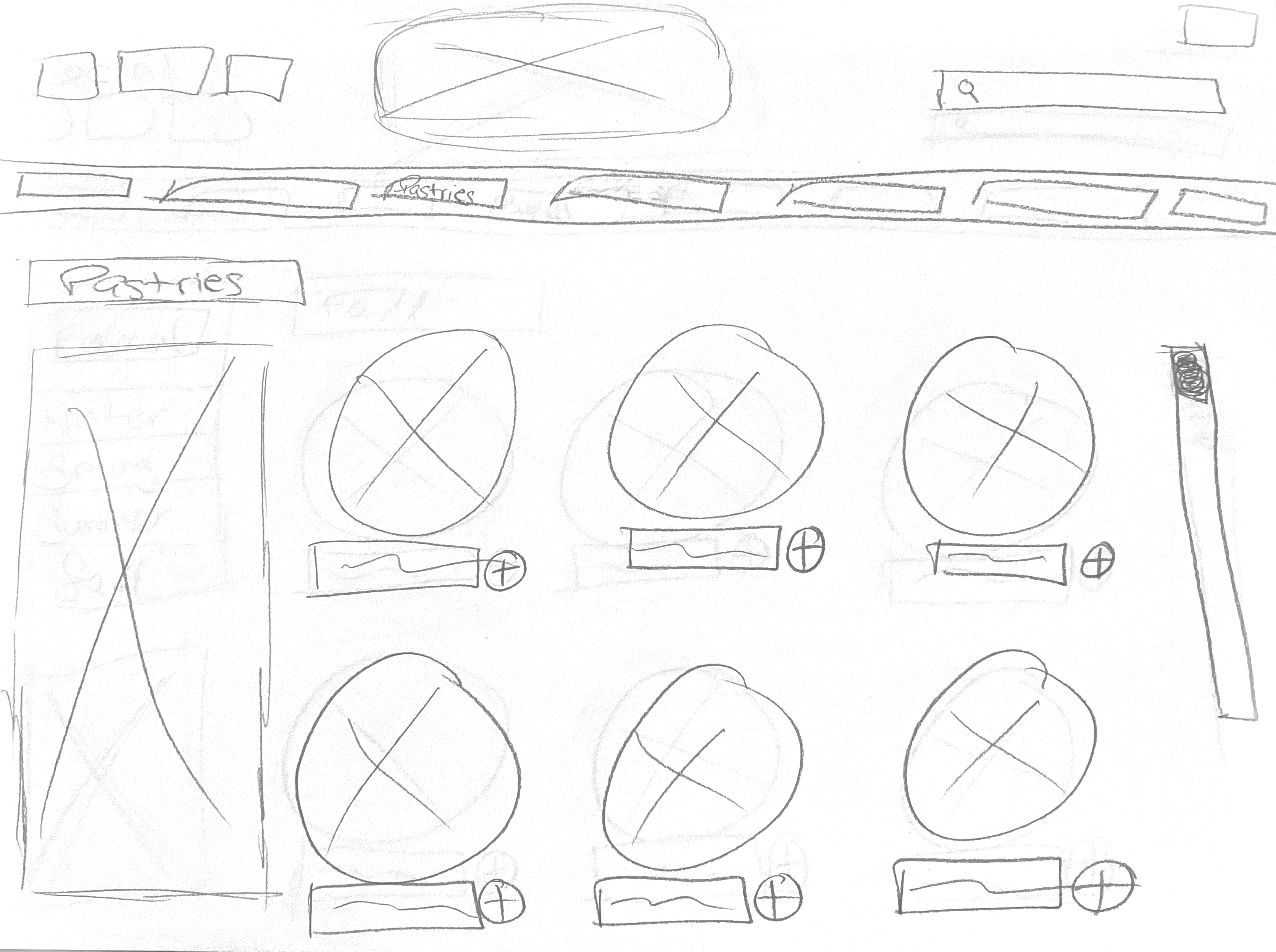
Pastries
If you don’t want custom but you need to bring something to the family dinner, this is a great tab. This includes things such as danishes, tarts, and even cannolis. I split this section up with the baked goods section because I felt like those desserts sit in different categories. This section is for the light and flaky baking whereas the next section is more about the thicker desserts like muffins and pies.
I think this section will be good for those people who want more than just a cake or who aren’t cake people to begin with. My father would rather have cannolis or a nice fruit tart for his birthday than a cake. Everyone has their things.
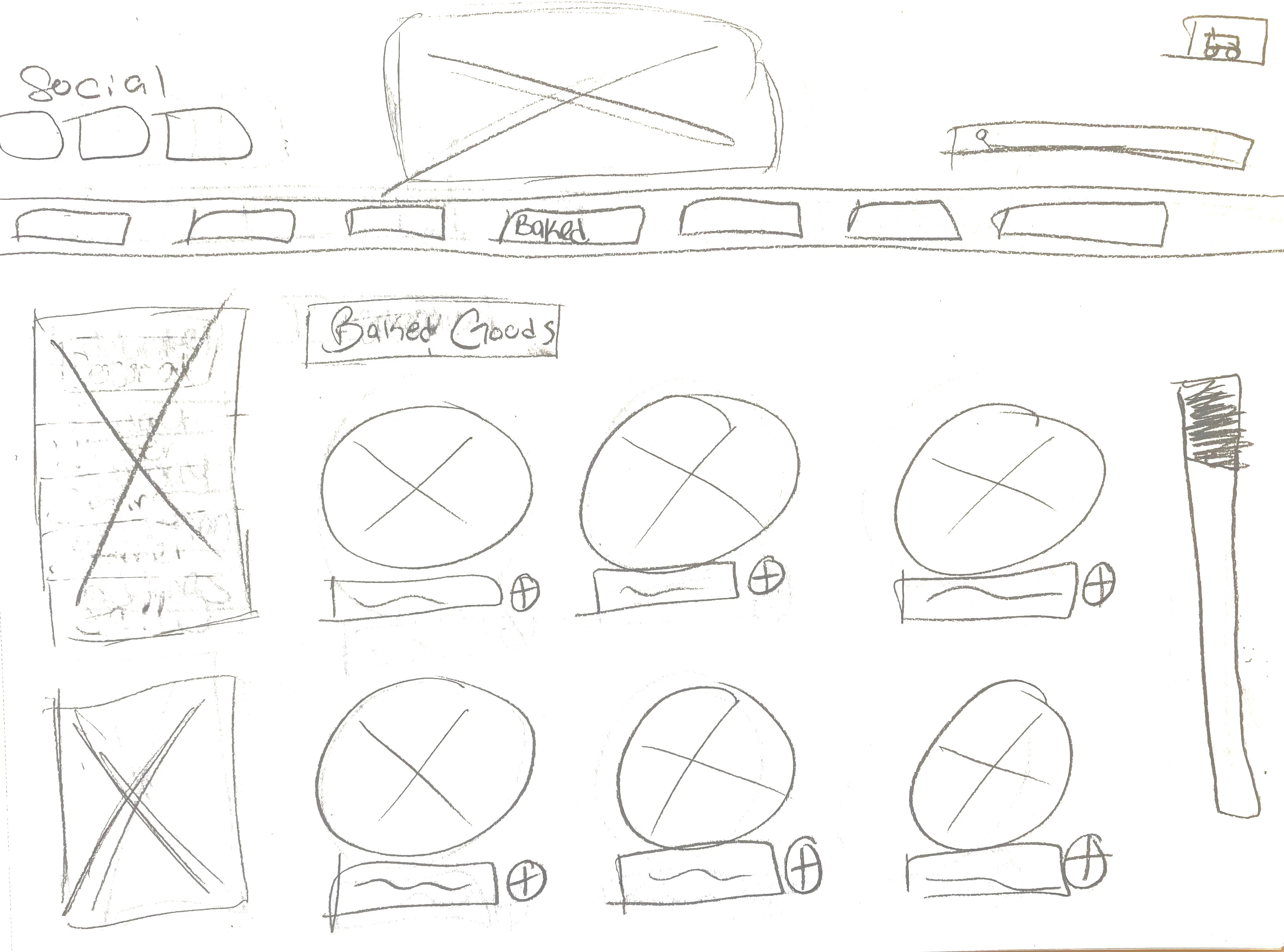
Baked Goods
This section is for the more traditional baked items like cookies, cupcakes, cake pops, and more. This will have more flavor variety and will be sold by the dozen. This is a great addition to any larger purchase. This widens the possibilities for the business to grow. When testing out new flavors, cupcakes and donuts are a great test subject.
This will be a staple section, with the same basic options that everyone will love. With that being said these are good to order for larger parties like weddings or graduation as they come in a bigger quanity.

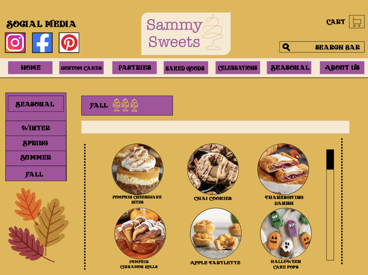
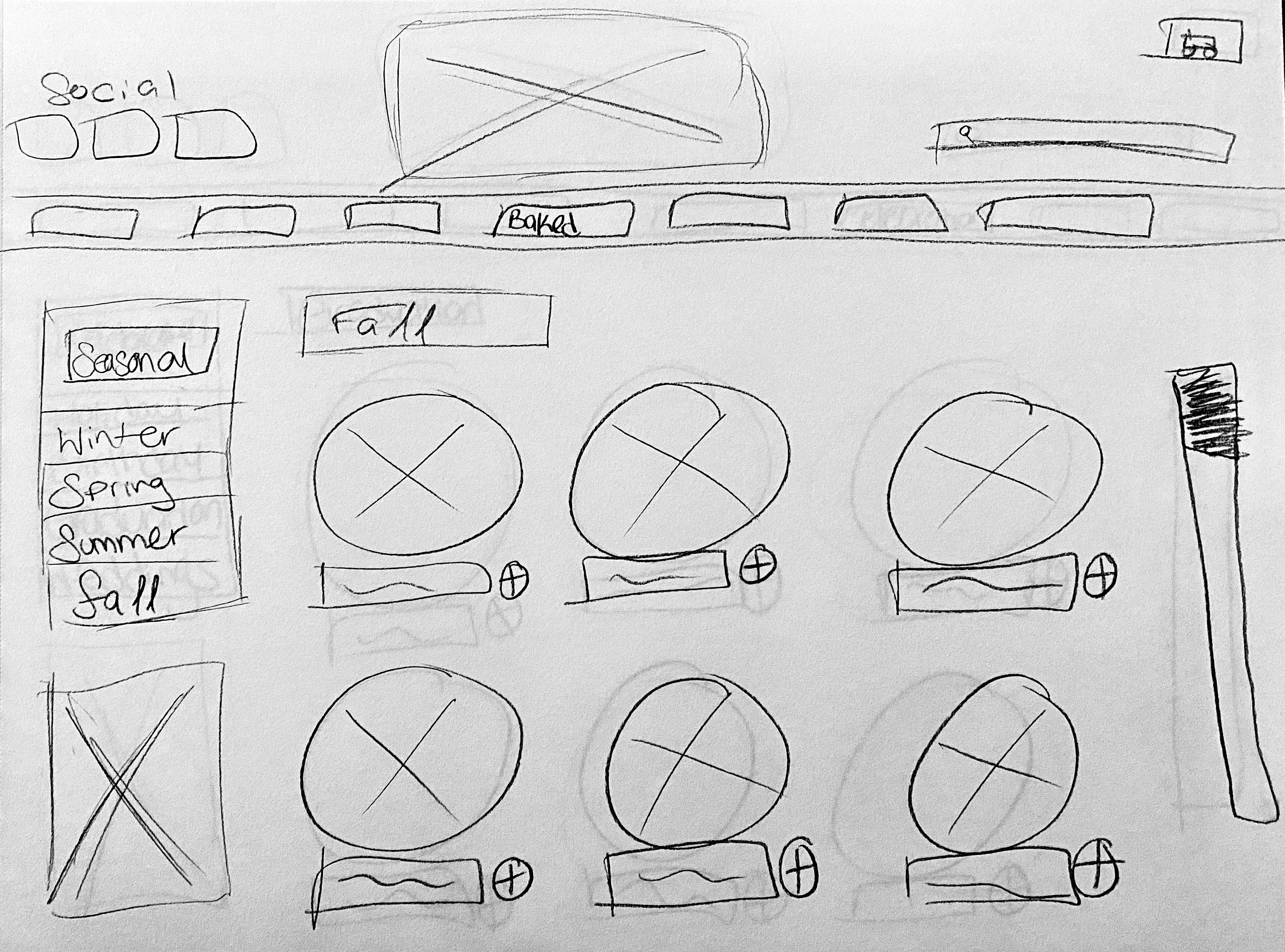
Seasonal
I know I always love when a business comes up with seasonal favorites, only sold at one point of the year. The anticipation of the seasonal treats will help keep the target audiences coming back for more.
These is a section to break down more of the needs of the customers. Fall items are so much fun to get for a thanksgiving table and maybe some lighter stuff for the summertime and the fourth of July. This too is a great place to experiment with flavors for future cakes. Let’s say the chai cake pops are a hit on fall season, that might be the new flavor for the custom cakes list. A great place to start small.
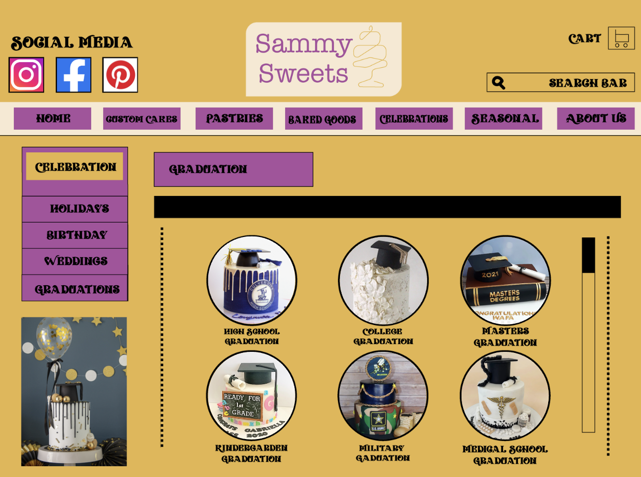
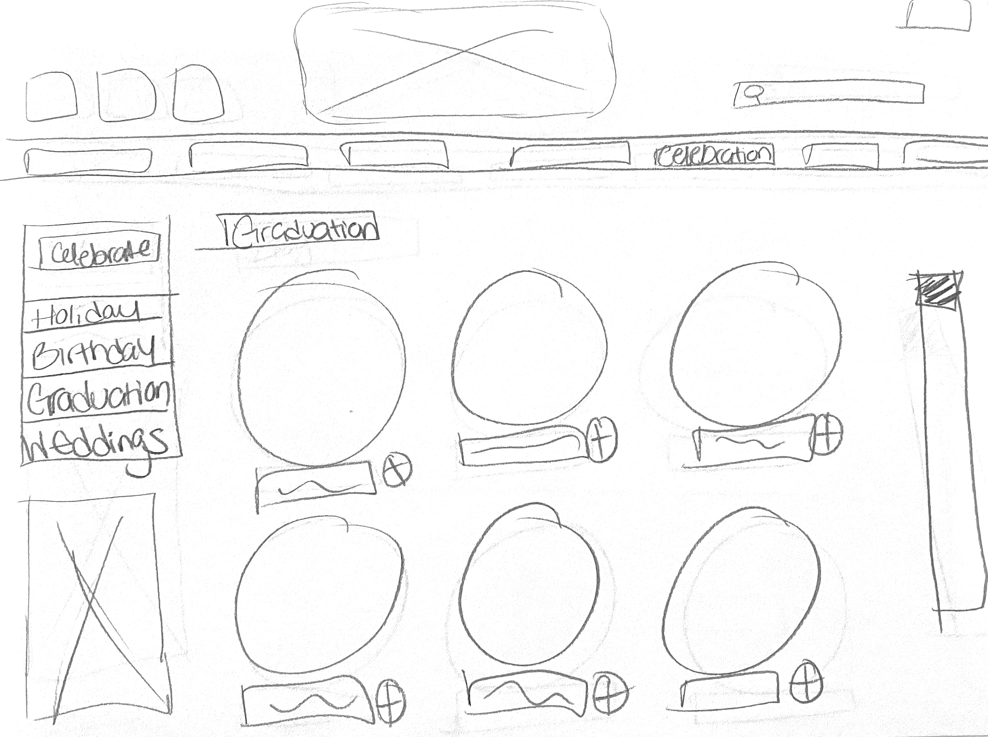
Celebration
This category is something I thought would help round out this brand. In this category you can pick a out different celebrations and the company has premade ideas that you can choose from. This can make finding a cake a lot easier, and sometime people don’t always want a custom, extravagant cake. Sometimes they just want a basic cake with a graduation cap on top. This would be playing to an audience that might be short on time and budget for a custom cake but still wants to make it a special day.
I think this might actually help the brides to be, maybe they want something more like a lot of cupcakes but still want something to represent the wedding cake tradition. A smaller wedding style cake will make their lives so much easier.
About Us
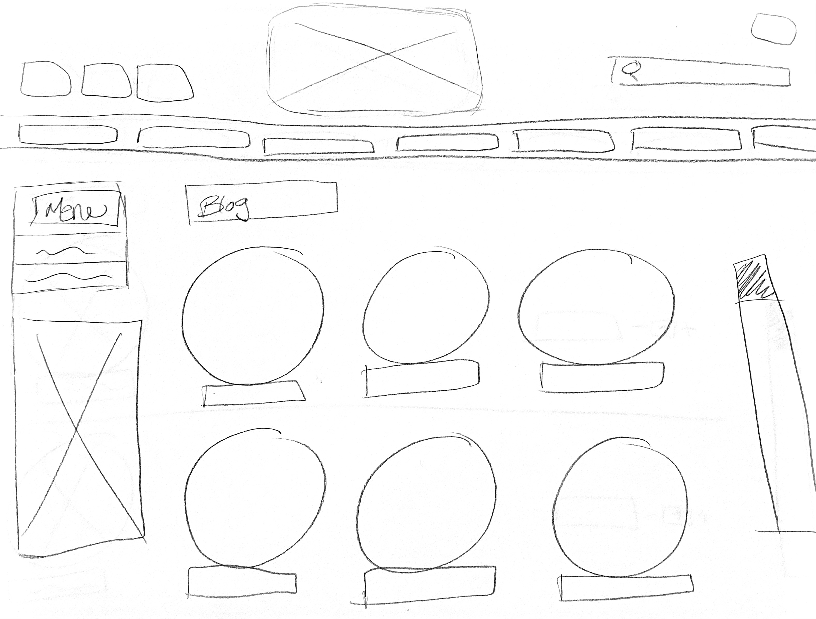
A big thing about building a business is all about connecting with your audience. No better way than having the addition of a blog. This is a place to share recipe, tips and tricks at home, and so much more. Not just making the website a shopping experience but also a place for learning and entertainment.
This is a good area to build upon as well, if it gains traction so does the business. It can grow to short video clips and even building a cookbook for the brand itself.

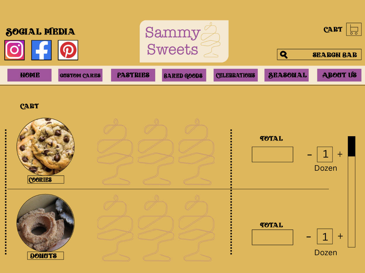
Check Out
This is a separate page so that the user can clearly see all the items that sit in their cart. This is very traditional for sites that provide sold goods. I really like the idea of adding in images so that the people knows exactly what they are getting.
Overall, this website is about an experience not just a transaction. I wanted to make it colorful and inviting for users of any age. I took inspiration from other local bakeries and custom cake shops to really understand what works and what doesn’t in the world of online baked goods.
