After four years of art school and about twenty one years of project runway, I can confidently say I made a cohesive collection.
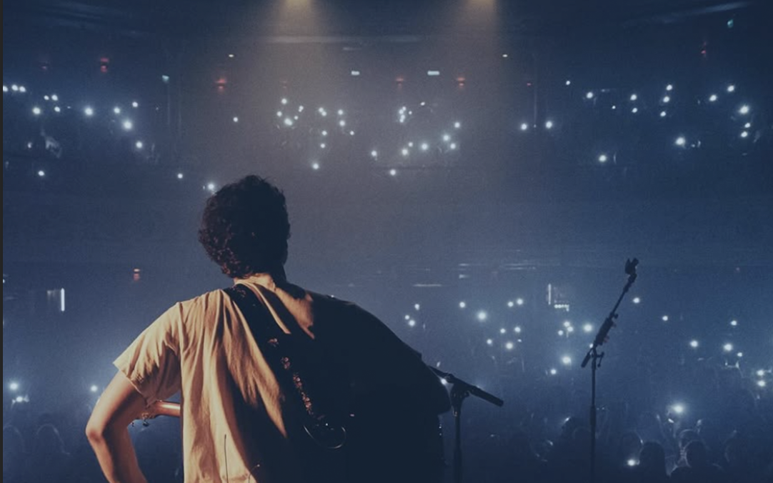
No, I am not a dress designer but I would like to call myself a graphic designer. I spent the last week coming up with (in my opinion) the coolest designs for one of my favorite artists, Mark Ambor. He is still a smaller mainstream artist but I am absolutely obsessed with his music. Also though his music rocks his merch and promotions not so much. I wanted to rework his promotional work.
In a full package of promotional materials for Mr.Ambor I layed out each task I had.
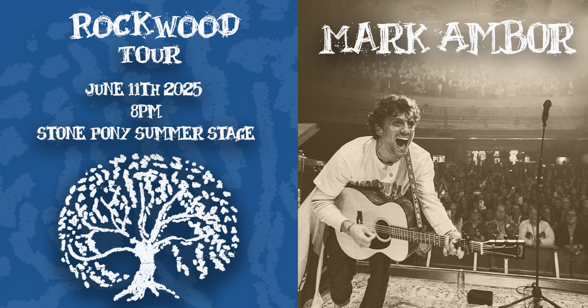
Posters:
- Larger, typically 11″ x 17″ or larger.
- Purpose: Designed to grab attention fast from a far distance and convey a message quickly, often for general public display or to advertise events/products.
- To also keep in mind, these are when people collect to put up on their bedroom wall so the fewer the works I have found the better.
- Design: Often feature large graphics and minimal text for easy readability from a distance. Large text is key!
- Distribution: Typically displayed in public places like bulletin boards, storefronts, or during events.
- Cost: Can be more expensive to produce due to larger size and often higher-quality printing.
I kept this design nice and simple. Mark Ambor is a folk pop artist and I this a color scheme of a darker yellow and blue help bring a softness that his music has as well. I also used this concept of framing him throughout the promotional line.

In creating this I put myself into the shoes of a person that wanted to hang up a poster in the room. This image is very stoic and tells this unwritten story. This builds interest with the audience.
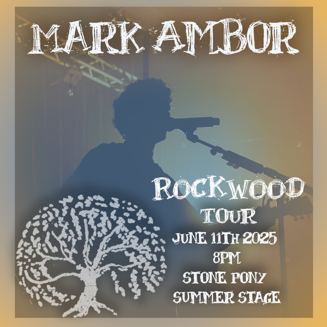
Flyers:
- Size: Smaller, typically 8.5″ x 11″.
- Purpose: Used for targeted audiences, to hand out directly to individuals, or to leave in public places for immediate action. Still quick information.
- Design: Can accommodate more detailed text and smaller images, as they are viewed at a closer distance. However I find that the words are the more important aspect of this design
- Distribution: Hand-distributed, left in stacks, or posted on bulletin boards.
- Cost: Generally less expensive to produce, even in large quantities.
This flyer leans more heavily on the yellow hue but blue is subtly in the image as well. This picture is to draw in people with this look of ‘i am the king of the world,’ However, I also made the words bigger to stand out next to the image and to be more of the focual point. That’s why the original image is more blurred than it started.

These colors give somewhat of a coming of age, like he is finally living his dream.
Banner Design (Event ):
- Dimensions: Use 1920 x 1005 pixels for event banners
- Event Title: Make it prominent and easy to read.
- Event Details: Include date, time, and location
- Visual Appeal: Use high-quality photos, graphics, or illustrations to create an engaging design.
- Branding: Incorporate your brand’s logo, colors, and fonts.
- Text: Keep text minimal and strategic, and use a clear and readable font.
This is a facebook banner, I feel like the addition of the album logo really pull in the eyes towards the works. With the image also being brighter he elevates from the page.
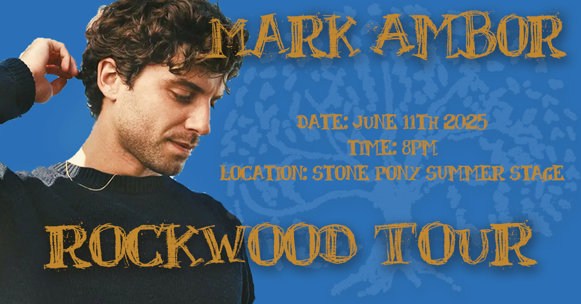
The drop shadow effect really helps bring out the letters and with a nice gold color over the images, it really does feel inviting.
Event Thumbnail Design:
- Dimensions: The recommended dimensions for event thumbnails are 1200 x 628 pixels.
- Content: Focus on a clear and concise representation of the event.
- Visuals: Use a captivating image or graphic that captures the essence of the event.
- Details: Include the event title, date, and location.
Usually if i split up images and informations, I was want to sit of the rule of thirds but in this case I both sides flow together. A thumbnail is also supposed to draw you in, and his face in this image says it all.
The contrast in the colors make both sides stand out in very different ways.
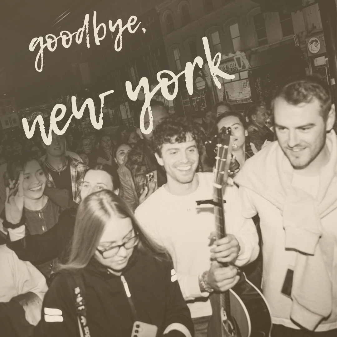
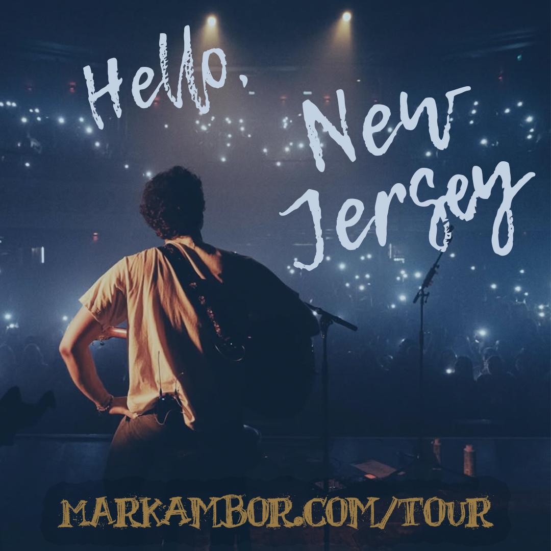
Social Media Post:
- Size 1080×1080 px
- Quick and fun grabbed attention
This first post is more focused on the information which the other post is more focused on the fans.
This post is a good way to close out one leg of his tour and bring in another. I chose these images very carefully as I wanted him to be facing a specific way each time. I wanted him to give the illusion of leaving New York and walking right onto stage in New Jersey. This connects concerts and fans from all over.
This last piece is more on the artsy side but is still has a focal point which is him. This post is more about drawing in the views than allowing them to figure out who this is and why they care.

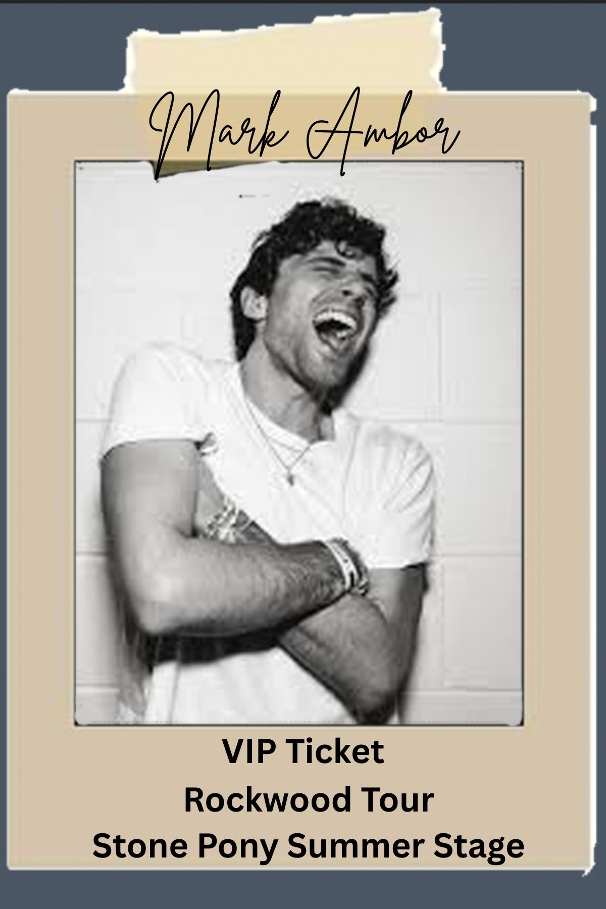
VIP Invite:
- Size 6×4 in
This is all about wearing him with you at his concerts. He is widely known for his crazy over dramatic faces, so why not make those apart of the VIP experience.
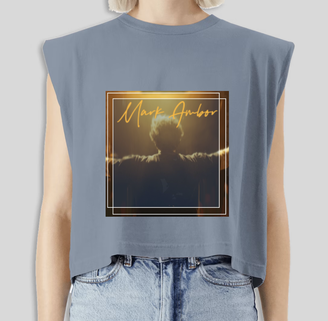
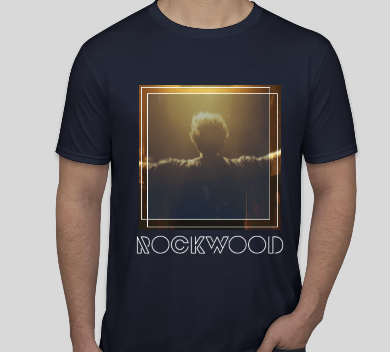
T-Shirt/Merch Design:
And at the end of the show what else would you want other than merch. I find that I like bigger graphics on the back on shirts. Everyone has a fairly flat back…not everyone has a flat front (If you know you know). The color scheme of yellow and blue still apply and really do help enhance all the images and words on the shirt.

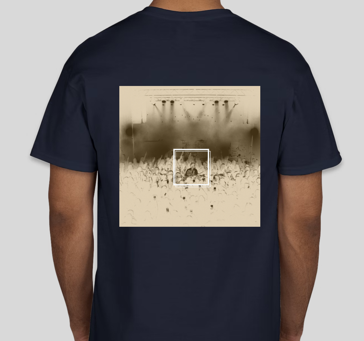
I think these shirts are super fun and very versitile.


Although this isn’t what his merch look like I would totally buy this at his concert. He has so many great images throughout his tour, I think he needs to start taking advantage of them.