What is Typography?
Typography is the world around us. It’s ok that you might not have noticed, I didn’t either. I’ve been doing graphic design since I was fourteen years old and sad to say font and typefaces were always an afterthought to me. I would go to a website and see what I felt worked with the image I had already created.
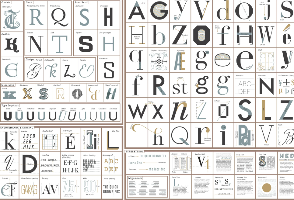
You can see in the image above, there is a lot we are missing, the small details in the curve of the letter r or the weight of the lines in the letter Y and how they are all different.
This week I got to uncover a new passion for fonts and how they interact with us daily. Like sound is to movies, font is the backbone of the ethos in a logo design.
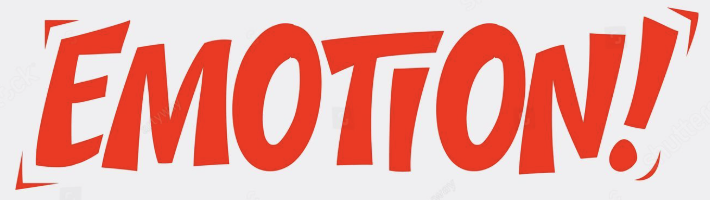
Emotions drive us whether we like it or not, and some fonts evoke different emotions.
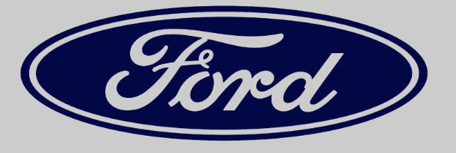
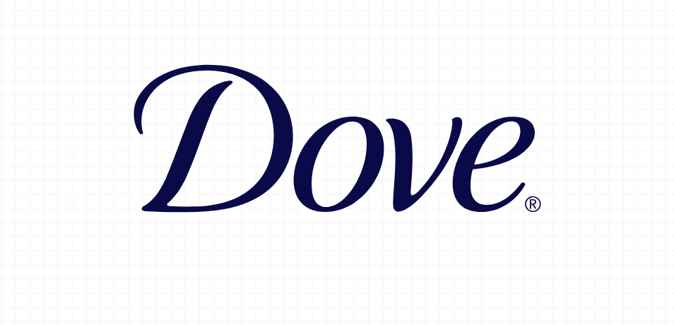
A softer, more round or curly font may give off a comfortable feeling. This is a good way for customers to trust the brands they use. For example, look at the brand Dove. This brand wants you to trust them enough to put their product onto your body, so the font needs to be inviting. This font is Civita Light Italic, light and soft and has an inviting feeling. Think about if Ford even, the brand and what target market they try to be hit? Ford has a strong and welcoming font, one that they want you to trust your family with.
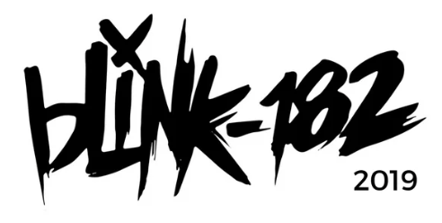
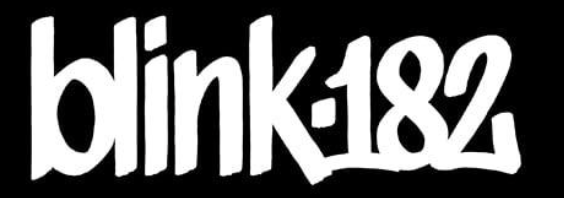
For other products/services the font can really change things. Look at the pop-punk band Blink-182. Their font is hard black, straight across, that looks like someone wrote in sharpe. It Evokes this idea of breaking the law and graffiti. They even changed it over the years to add more sharpness and edge to it. It fit the genre and the emotions within it.
Still don’t believe me that fonts are everywhere. You are currently reading Figtree semi bold in size 20 px.
Outside of fonts, there is a lot that goes into typefaces. Something as simple as an ascending line can throw off the font itself. When choosing a font, knowing the baseline and if you want to follow it is super important. For me I tend to lean towards fonts that don’t have ascenders or descender because I like a perfect line straight across. That’s what’s so great about fonts, is that everyone has a different opinion and typeface they like.
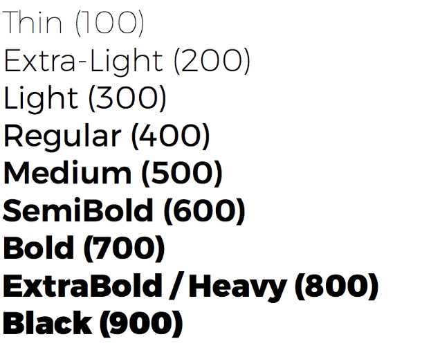
Don’t even get me started with the weight. No, I’m not calling the letter fat, just thicker. Common weights are light, regular, medium, and bold. We all know when we are trying to scream over text that we wish it was capital bold lettering.
So I challenge you to start looking at fonts more. You see them everyday, what’s the font on your phone? What’s the font on your shampoo bottle? What’s your favorite font? Is it the one that brings you the most joy and happiness?
