Website Site Map
Disclaimer!
I am new to this whole website design thing but I know confidently Belmar Municipal Website is rough!
It felt like they threw everything and the kitchen sink into the site. This made the site confusing and quite frustrating at times as a user especially when the same information would come up as a repeat in a few different levels to the site. This would be a negative effect to a cognitive load. That is what the user can take in at one time to not be overwhelmed with information. I was overwhelmed with information.
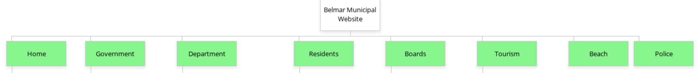
I did a basic site map of the current website and it was LONG! Look at all these tabs!
What is a site map?
For those of you who also don’t really know what a site map is, it’s Information Architecture or IA. The IA is used to organize and structure all relevant titles. This is what the different tabs are and where they lead. Like a road map to the website.
Why are sitemaps important?
Sitemaps are the backbone to planning a website. A visual sitemap helps you outline a website with the user journey in mind. Visual sitemaps give you a bird’s eye view of the current user flow so you can identify opportunities for content optimization and even flag duplicate content. It is very clear that Belmar’s Municipal website lacked a point of view through a site map.
The sitemap representation of the current Belmar Municipal Website.
This website is primarily based around main navigation, which means it’s task and activity driven. While I was creating the site map I had in mind usefulness and effectiveness for the users that would go to this page.
The questions that I kept in mind were, what is the primary goal of this website? Who is the target of a municipal website? Are we serving those people correctly? And Who would we want to target in the future?
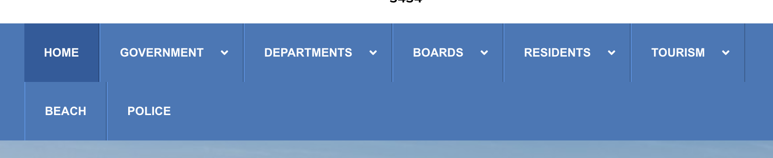
Tier 1
Starting with the first tier, in lime green, this is the primary navigation. The home page is a horizontal list representing all the categories the website offers. This included government, departments, residents, boards, tourism, beach, and police. These tabs at first glance seem to work but as I went deeper into the site map I found them quite vague. I personally didn’t like that beach and police automatically took me to another website in a new browser. This didn’t allow room for growth and more information.
Tier 2
The second tier, are the pages that branch off from the first-tier pages, often appear in a dropdown menu. This is represented in the color pink. This is the sub secession to the primary tool bar. Up to this point, the site seemed pretty user friendly. However, this tier has vague titles and repeat information that could be better all under one tier. Having police and fire and medical services all in different spaces seems confusing for the user. The website needs to have more focused navigation.
Tier 3 & Below
The third tier is where it feels all over the place. Represented in orange, this is where the real confusion starts to happen. This can easily confuse a user, it feels like there are multiple tabs for the same ideas. It feels like the labels aren’t disclosing enough information. If I’m searching for housing it will come up under community development and forms and applications I will be lost.
This goes directly against Gestalt principles, that things can be matched in a level or tab based on what makes sense to the user even if it doesn’t make sense to the overall website. This is always something to think about when building a website, having all the same information in the same location. For example, if it was a clothing website and skirts were under the bottoms tab but also somewhere under the denim tab it can start to all fall apart. Fewer layers that carry more information might help this website succeed.
With that in mind, I thought I would try to reinvigorate the app. I created a new site map for the Belmar Municipal Website.
NEW AND IMPROVED
Before showing you what I came up with I wanted to explain what I was thinking about when I was creating this. Starting with the ‘Eight Rules of Information Architecture‘ by Dan Brown
- The principle of objects – Treat content as a living, breathing thing, with a lifecycle, behaviors and attributes.
- The principle of choices – Create pages that offer meaningful choices to users, keeping the range of choices available focused on a particular task.
- The principle of disclosure – Show only enough information to help people understand what kinds of information they’ll find as they dig deeper.
- The principle of examples – Describe the contents of categories by showing examples of the contents.
- The principle of front doors – Assume at least half of the website’s visitors will come through some page other than the home page.
- The principle of multiple classification – Offer users several different classification schemes to browse the site’s content.
- The principle of focused navigation – Don’t mix apples and oranges in your navigation scheme.
- The principle of growth – Assume the content you have today is a small fraction of the content you will have tomorrow.
Outside of that, I kept in mind how I would use the website as someone from Belmar. What the important things would be to a resident? And What an outsider might look for?
I did some research into another town website near Belmar, and grabbed inspiration on tab names and where the flow of the page should go. I found that this website seemed simple and easier to use. But I wondered why that was? And if that affected how much information the site held?
Tier 1
My first tier is shown in green and paired down a lot from the original website. With Home, government, services, locals, and visitors. It seems like I wouldn’t have enough in the primary space but I put the information in the second tier so that things stayed together more. As a user this made the tabs less daunting and easier to understand.

Tier 2
The second tier is shown in blue and has better groupings with more descriptive names. If the folder says forms and docs, it will be all basic forms and docs that people would need. This allows the user to flow through the site a lot easier.
I put all online payments in the same tab so that a resident can go right there to pay any bills or traffic tickets. A tab for only money transations.
In the original website, the beach tab just went to another website, in my new rendition, I put beach information under the home tab because Belmar is a beach town and destination. Having a good understand of the location can help understand the users in the location. Belmar is a beautiful beach town that see millions of tourist each year, the beach information for be on the homepage for anyone to find.
I changed the tab from residents to locals because that is how the people speak and I think it made it clear who it was for.
Tier 3 & Below
Because tier 2 has so much information, the third tier and below, show in purple and orange became even more straight forward. It felt more tailors to specific needs and problem instead of a free for all.
Why the redesign is needed?
Overall, I think the new design came with a lot more logic and flow. I tailored this new design for locals to know about snow days, street cleaning, bills and much more. I also tailored it to help grow tourism, by giving valuable research about local dining and shopping to the visitors who join.
Cited Work –
Brown, D. (2010). Eight principles of information architecture. Bulletin of the American Society for Information Science and Technology, 36(6), 30–34. https://doi.org/10.1002/bult.2010.1720360609
