Websites are all fine and good but apps are really where the future is headed.
Belmar Municipal App is the focus of this article.
Websites hold a lot of information and personally I don’t think an app needs all that. I think an App is more about immediate needs and wants and a website just furthers that information.
After reviewing the website, I wanted to do a sitemap for an App that can help the town as a whole.
Where to Begin?
To start with defining the goals and purpose of this app I kept in mind that mostly residents/locals would use the app the most. They are the primary downloaders and I want to serve their needs and wants the most while still having other information for visitors.
After that, I thought about user flow and what residences would use the app for?
Primarily, I think it would be used to pay bills and know what is going on in the town. So events, news, daily life (Street cleaning and snow removal) and construction came to mind. It is important to put the most used features easy to find and use.
Tier 1 or Main Screen
Starting with the hierarchy or the main screen, I had the primary tabs labelled as home, how do I?, residents, visitors, and events/news.
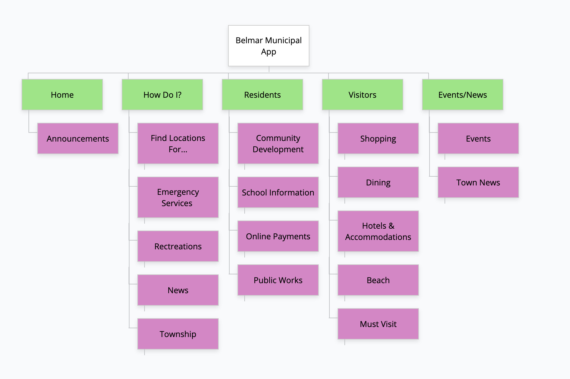
Home
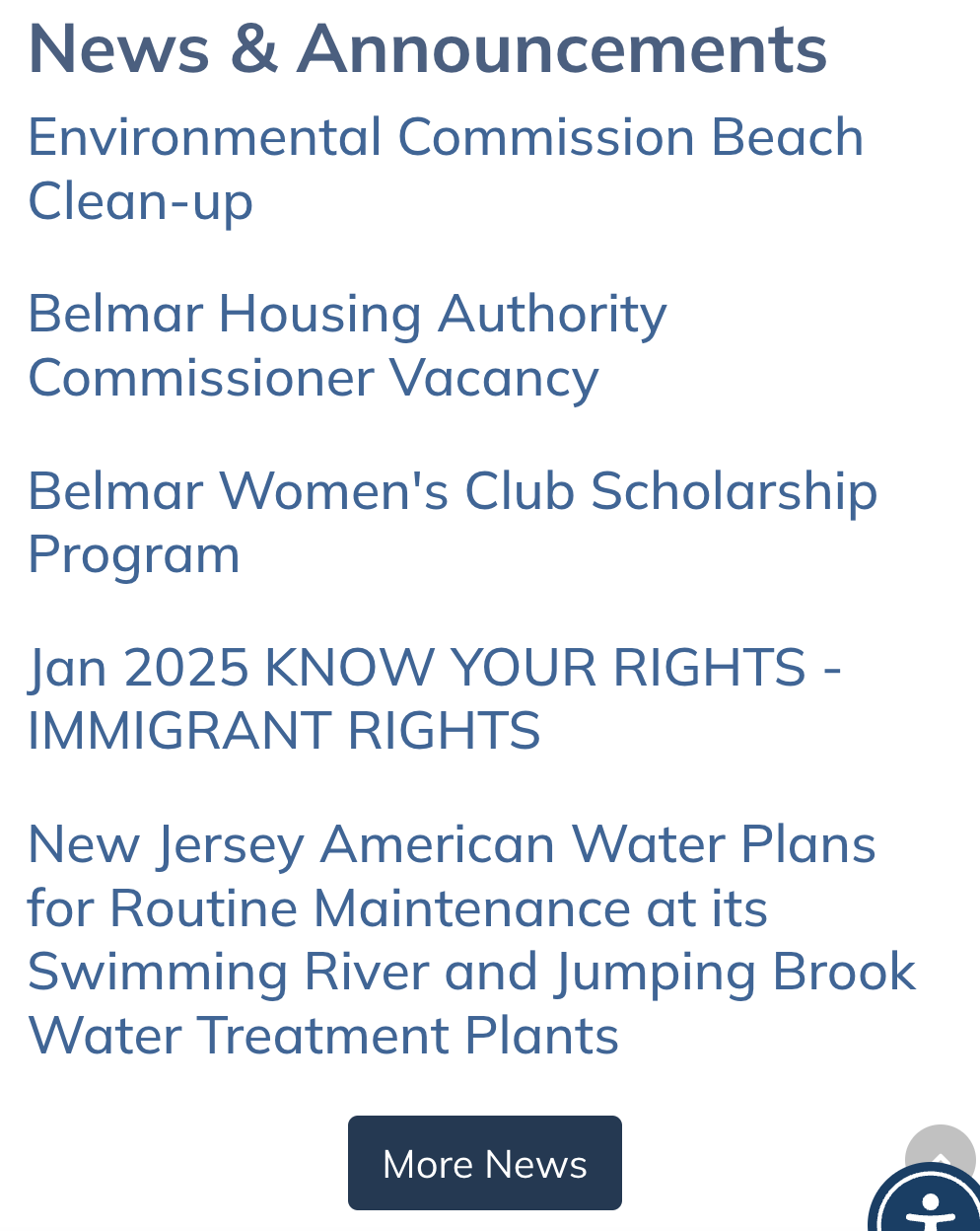
For this I kept the home page simple, just announcements that were important like road closures and tree trimming stuff. This will come in handy for the primary audience when commuting to work or going out to do anything.
How Do I?
As for the tab, How Do I? This is a direct route to frequently looked for items. For example, finding locations for the library and municipal buildings and contact information for emergency services. As a resident, this is information that I would look for on the app to have in a moments notice. This helps the flow of the app because it allows the user to find information that need faster and easier. I grouped this category togther by user importance.

Resident
Then under the resident tab I included paying bills and public work information that people would like to know like what day is trash pickup, snow removal and beach cleaning.
Visitors
With all that being said, I also created a tab for visitors to help them navigate when they arrive into town. Considering it is a beach destination, I wanted that tab to direct visitors to local restaurants and businesses. This can help flourish the economy.
I paired down from the website while keeping the vital everyday information accessible. I opted to not include as much about the government and town council meetings because I don’t think that fits into a short form like a mobile app. I’d rather watch or read something long on my computer over my phone which is a lot smaller.
I used the principle of choices, by giving enough options that were more meaningful and placed more on a specific task. It helps users interact with the app easier like dining options in the area.

I tried to have more focused navigation, to not mix things together that didn’t belong. Grouping for the user helped me stay focused on what to put where.
With the home page being announcements only I feel like I allowed for growth and adaptability. New information comes out each day and the app needs to be abel to grow with it.
Apps are for quick information, that is what I feel like I have done.
