Dog Groomer by day, dessert connoisseur by night. Sweets By Sam is a small, almost nonexistent brand. But it wants to be! Sweets By Sam is all about the creativity and precision of one woman who loves to bake. She makes custom cakes and cookies and other sweet treats as well. So I am helping her revamp her business and hopefully help grow her dream career.
This business has a voice that is soft, colorful, homie and authentic. Sam is down to earth and at the core of herself she would do this for fun regardless.

Sam runs a New Jersey based brand who does small and large custom designs and baked goods for all occasions. You’ll find the brand voice present in everything from the color of the packaging to the fun social media captions, short-form cooking videos, and so much more.
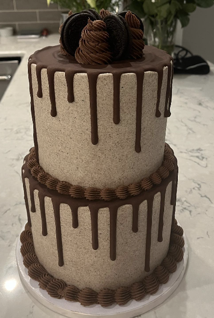
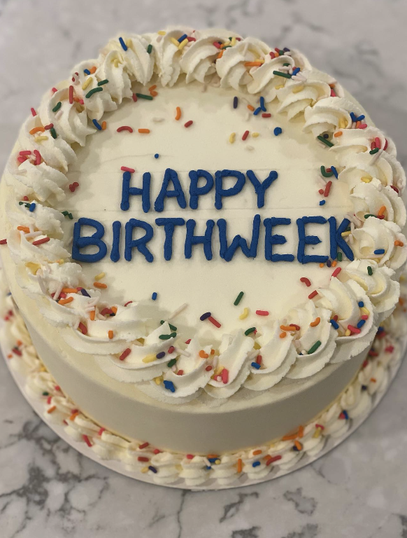
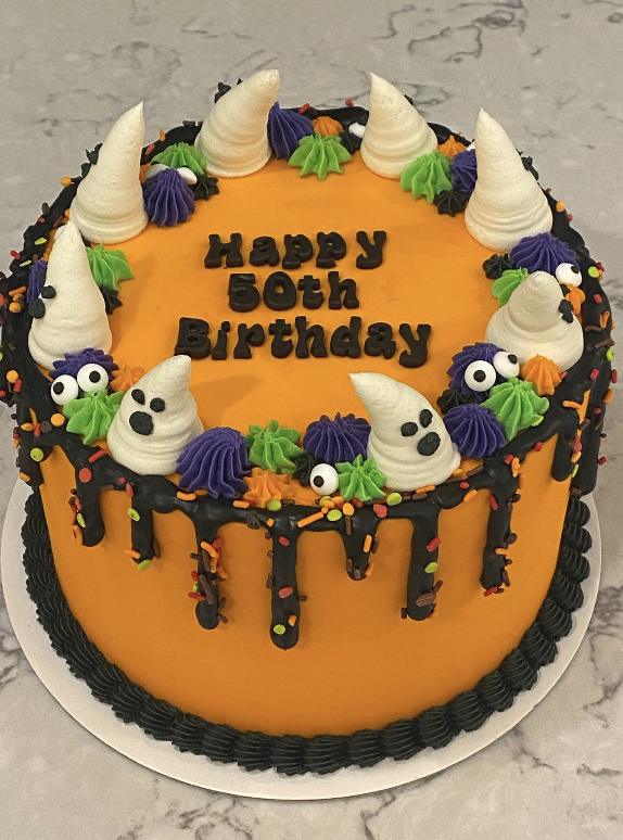
Sweets By Sam is baked from scratch, with unique flavors and design all in one. No fondant or extra stuff that tastes stale. Everything is fresh and full of flavor. The Sky’s the Limit! With her precision icing skills you wouldn’t be able to tell the difference.
To start this revamp I did want to better understand her target audience.
Sweets By Sam will hit as a primary target audience women between 21-65, middle to upper class, around the tri state area, events, and other gatherings. With that idea she will want a more professional and recognisable name and logo. This will come with adding softer colors to appeal to women but also a unique one that will stay in their mind when big events come around. Something they can describe to their friends during Sunday brunch.

For the short term plan, landing on a name and new logo will be top priority.
The name ‘Sweets by Sam’ is cute but unfortunately someone already has the name and it just seems a little juvenile for who she is and what kind of brand She wants to grow. So, I can come up with some names to pitch to Sam. We will see if any of those will stick.

As for her current logo, the colors are not helping make this business look professional and put together. So I sketch up some redesigns that were simple, played off the original, but gave the font and color a face lift. A similar local brand Baked By Melissa has a rainbow cupcake design that has become a staple in the north east. Simple but stands out! That is what I want for Sam.
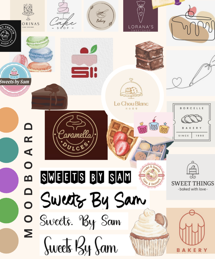
In my moodboard I took inspiration from other bakeries around the world to get a better understanding of the pop I need to include. I have a couple options that will be discussed with Sam herself to get approval of. As for color I pick some neutral colors with a little bit of pop. No straight pink and blue, that screams baby shower and that is not what she wants to be known for.
As for long term goals, it would be great to open up a cafe with a commercial kitchen and really get to expand the menu and build a local and regional following. Within that, being a place for tourists to also come from far and wide would just be the icing on the cake.
For brand slogans I came up with some quick and easy ones.
- What you need at the end of a day
- Work hard, eat more Sweets
- Hard World, Sweet Treat
- You Deserve a Treat
- Just a Little More…
Similar to the crumble cookie …”Every Last Crumb”.
Hopefully a new color pallette and design can bring this business to life!
